01 / The Casebook / Professional Services — Personal Brand
The Support Layer
Turning a broad virtual-assistant offer into one page a busy founder can read in four minutes.
A content and interface casebook for a virtual-assistant practice: eight service lines, six work samples, direct contact channels and an enquiry form designed to keep the lead even when email fails.
- Role
- Content & Interface Design — Frontend
- Category
- Professional Services — Personal Brand
- Status
- Live
- Year
- 2026
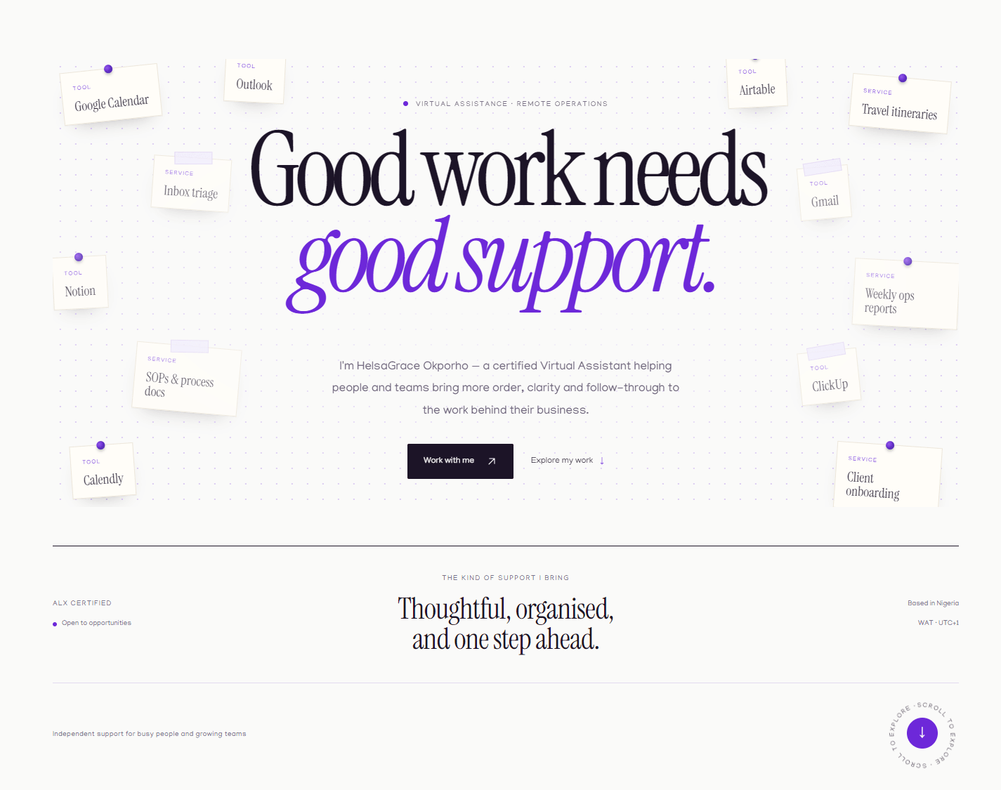
01 / Context
A virtual assistant's range is easy to list and hard to make believable.
The offer spans calendars, inboxes, travel, documentation, remote-team coordination, customer support, reporting and tool setup. Written as a list, those eight lines flatten into the same promise every VA page makes: organised, proactive, detail-oriented.
The page had to do something harder than list the work. It had to show the judgment behind it: what gets handled, what gets escalated, what a handover looks like, and why a founder can stop carrying the detail in their head.
I treated the page as a single reading surface rather than a set of marketing sections. The visitor should be able to move from the opening claim to a service, a sample, and a way to start a conversation without losing the thread.
- One positioning line, not a list of adjectives
- Eight service rows with concrete tools and outcomes
- Six work samples with an explicit mockup disclosure
- Direct channels and a form on the same page
02 / The problem
The page has to answer a hiring question, not win a design award.
A prospective client is not evaluating typography. They are asking whether this person can be trusted with the calendar, the inbox and the client handover while they focus on the business.
That question is answered by specificity. “Inbox management” is weak; “triage, labelling, follow-ups and clear escalation of what needs your attention” is a working description. The copy had to name the tools and the boundary of the work.
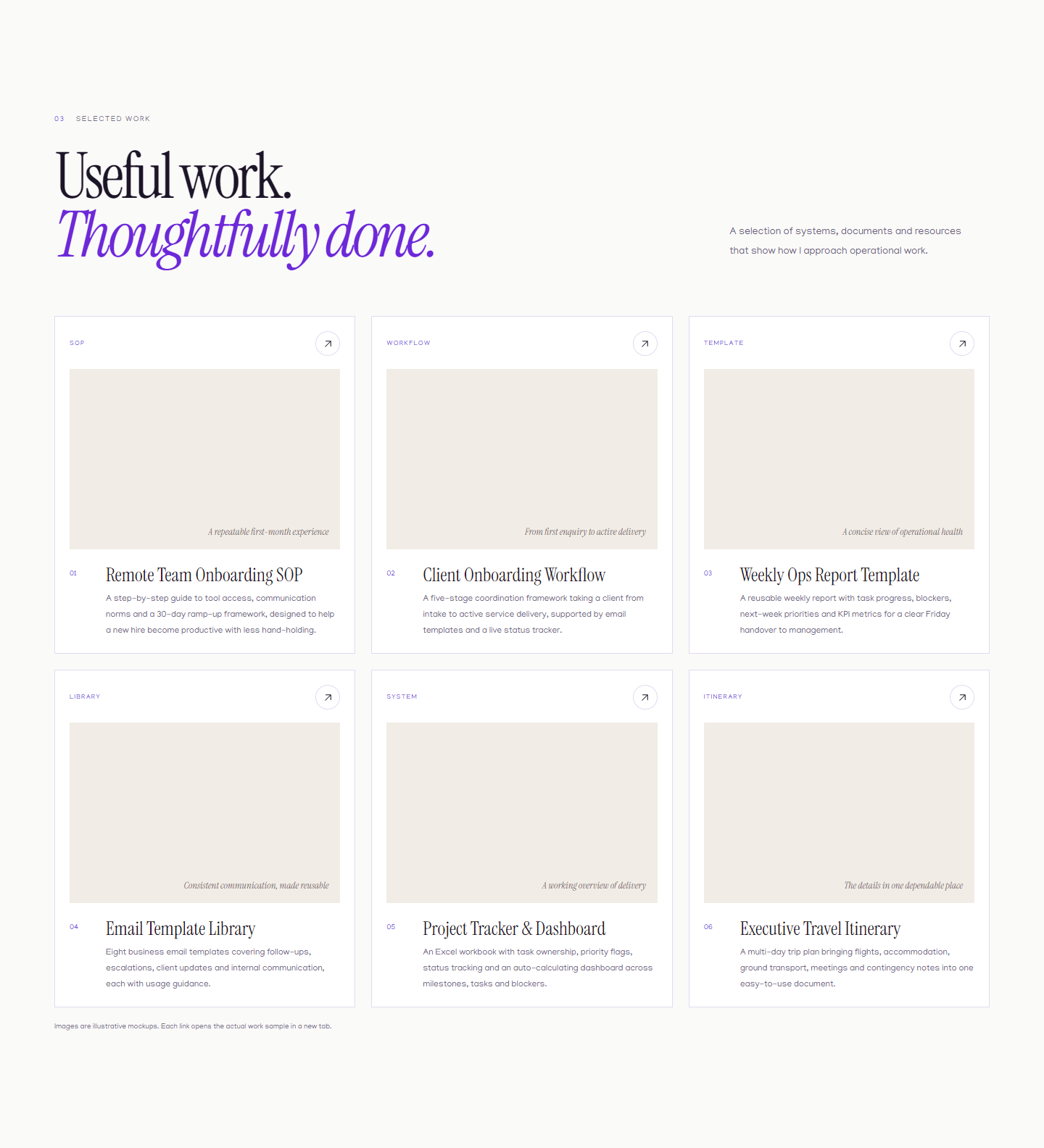
The second question is credibility. A new practice cannot borrow scale, so the page has to show the shape of the work: SOPs, workflows, templates, trackers, itineraries and an email library. The samples are presented honestly as illustrative mockups, not as client outcomes.
03 / The reading path
Four minutes, five decisions.
The page is ordered around the questions a visitor actually asks, not around the sections a portfolio usually has.
- 01
Land and recognise the offer
The hero states the role, the audience and the outcome in one screen: good work needs good support.
- 02
Check the fit
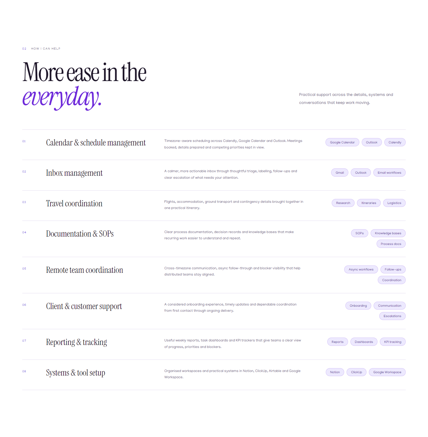
The eight service rows let a visitor find their own problem — calendar chaos, an unmanaged inbox, a team spread across time zones.
- 03
Look for evidence
Six samples show the artefacts behind the promise: an onboarding SOP, a client workflow, a weekly report, a template library, a tracker and an itinerary.
- 04
Decide whether to trust
The about section, the ALX certification, the availability note and the résumé link carry the personal credibility.
- 05
Start a conversation
Direct email, LinkedIn, WhatsApp, phone or the form; the visitor chooses the channel they already use.
“Range becomes credible when it is organised.”
04 / The service architecture
Eight rows, one rhythm.
Each service is a row with a number, a title, a plain description and a set of tool tags. The structure makes comparison easy without turning the page into a pricing table.
The numbers do real work: they give the eye a path and make the section feel finite. A visitor can see that the offer is broad but bounded, which is more reassuring than an open-ended “and more”.
The tags are not decoration. Naming Calendly, Google Calendar, Outlook, Gmail, Notion, ClickUp and Airtable tells a visitor whether their stack is already understood. It also keeps the copy from hiding behind generic capability language.
05 / The surface
Explain the work, then show the artefacts.
06 / The visual system
Editorial warmth, operational clarity.
A serif display face carries the argument; a humanist sans carries the reading; a mono label system carries the operational detail.
Paper
#FAFAF9
Page ground
Ink
#1C1427
Primary text and buttons
Muted
#6B617A
Supporting copy
Violet
#6D28D9
Single functional accent
Lilac wash
#EDE9FE
Tags and quiet surfaces
Rule
#E2DAEF
Borders and dividers
Typography
Instrument Serif
Manjari
IBM Plex Mono carries numbers, section labels and small metadata.
Components
- Sticky headerWordmark, three section links and one accented contact action.
- Section labelA two-digit number and a short uppercase label; the only place the mono face is loud.
- Service rowNumber, serif title, plain description and tool tags; hover shifts the row and accents the tags.
- Work cardType label, mockup, number, title and summary; the whole card is one link.
- Contact blockOne violet email panel, three quieter channels and the form.
07 / The enquiry
The lead matters more than the notification.
The form is short because the visitor is already convinced by the time they reach it: name, email, what they need help with, and an optional note. The direct channels sit beside it for people who would rather not use a form.
The server action writes the enquiry to Supabase as the durable record and sends a Resend notification as the prompt. The two paths fail independently. If email fails but the row is stored, the visitor still sees success, because the enquiry has not been lost.
The privacy line is part of the interface, not a legal afterthought: the name and email are used only to reply, never shared, sold or added to a mailing list. The recipient list is configuration (`CONTACT_TO_EMAIL`), not a hardcoded address.
- One required name, email and support area; the message is optional
- Stored in Supabase before the visitor is told it worked
- Email failure does not discard a stored lead
- A visible privacy promise beside the submit button
08 / Mobile
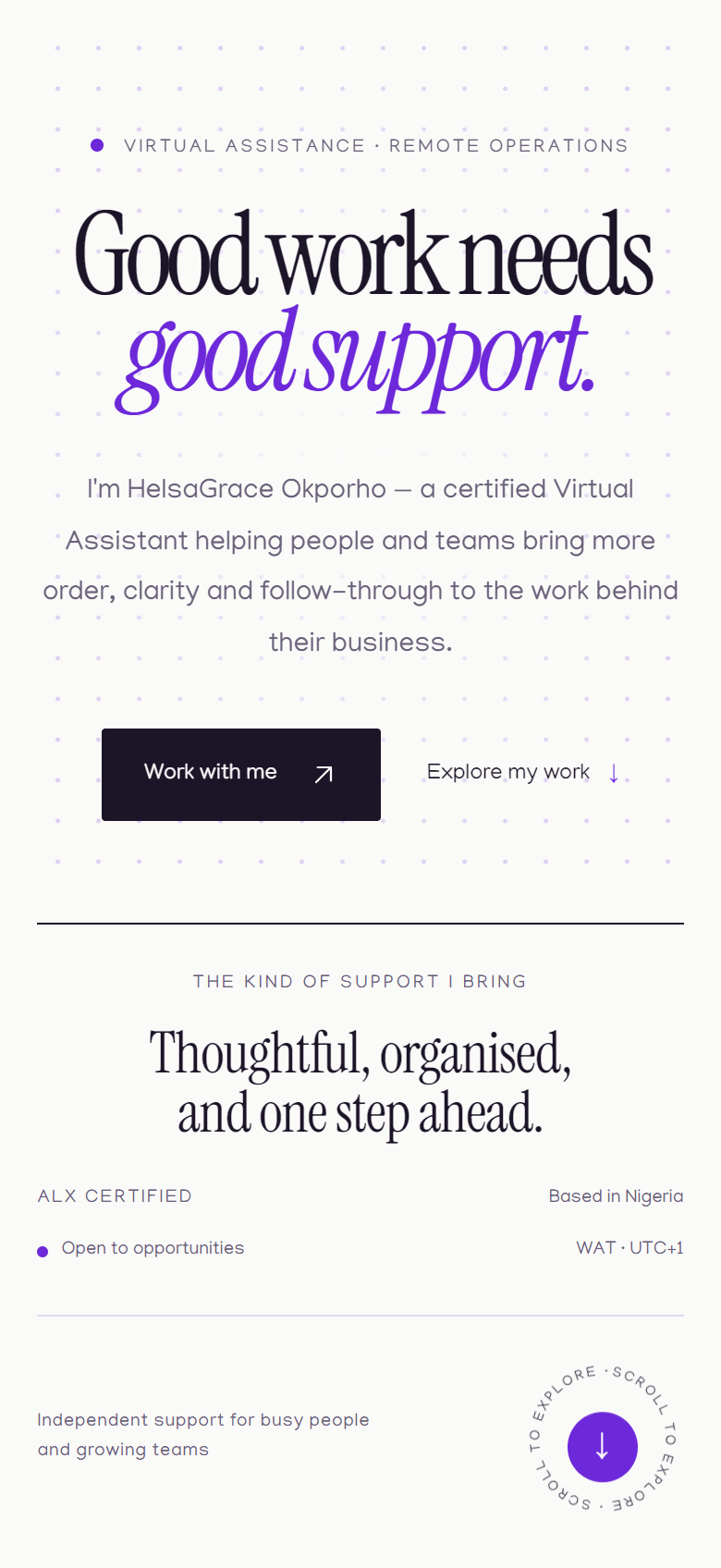
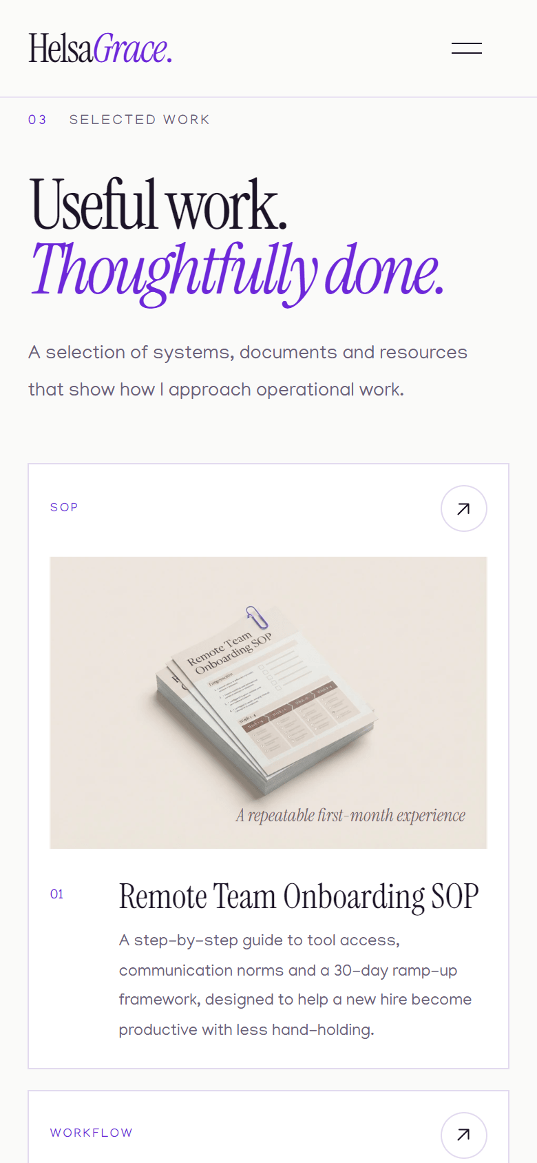
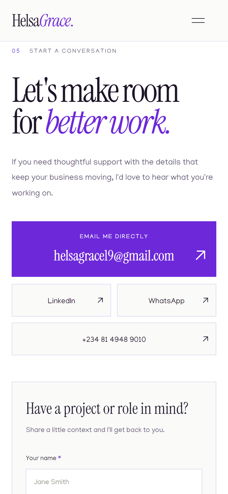
The same argument at 390px.
09 / Reflection
The hardest part was deciding what not to explain.
A personal practice page can easily become an autobiography. The version that worked keeps the person present — the voice, the certification, the availability, the face behind the email — without making the visitor read a career history before they know whether the service fits.
The second decision was to keep the failures visible. The QA workbook records eleven failing steps and nine open defects. A portfolio that only shows the polished surface teaches a client nothing about how the work will be handled when something breaks.
The part I would revisit is the length of the page. The sections earn their place, but the reading path is still long for a visitor who only wants a phone number. The sticky header and the direct channels are the escape hatch.
Specific over broad
Eight named services with the tools and boundaries attached.
Evidence over adjectives
Six artefacts, disclosed as illustrative mockups.
One accent
Violet marks the action, the number and the emphasis; nothing else competes.
Honest contact
A privacy promise and a failure path that does not lose the lead.
10 / What is next
Close the hardening gap before adding surface.
The page is live and the reading path works. The next pass is operational: add a honeypot, a per-address rate limit, input length caps and an idempotency key to the enquiry action, then associate validation errors with their fields.
After that, the discovery layer needs to match the page: a VA-specific robots and sitemap decision, a social preview image, and a LinkedIn destination that a logged-out visitor can actually see.
None of these are redesigns. They are the difference between a page that presents well and a page that can be operated with confidence.
- Add abuse controls and length caps to the VA action
- Add field-level errors with aria-invalid and aria-describedby
- Decide the canonical discovery URL and update robots/sitemap
- Add a 1200 × 630 social preview image
- Confirm the public LinkedIn profile or replace the link
Next in The Casebook
The Salary Problem
A proposed desktop workflow for OPay that turns 20–27 individual salary transfers into one reviewed, auditable batch — designed from the firsthand experience of processing monthly salaries.